Demonstration · Illustrative data · BI Consulting Services
AE
Ag Express Electronics×BI Consulting Services
Prepared for Darnel Divisional Manager · September 2026
Sulphur Springs bench board: intake, turnaround and what left the building
You asked for custom Power BI reports/dashboards for our site in Sulphur Springs, IN. This is what one of those could look like on day one: every unit that hits the dock, how long it sits on a bench, whether it shipped inside the 3–5 business-day window your site promises, and how the wire-harness cell is keeping up. Switch to Des Moines or Grand Island to see the same page as a network view.
Units in vs units shipped, by month
Bars are dock intake and shipments; the line is average bench turnaround in business days against the 5-day ceiling.
ReceivedShippedAvg turnaround (days)5-day ceiling
What this board answers
Three questions a divisional manager asks on Monday morning, each answered with a number that recalculates when you change the filters.
Bench flow: where units come from, which bench they land on, and how they leave
Left: brand on the unit. Middle: the bench or cell that worked it. Right: outcome. Ribbon width is unit count for the selected filters; hover any ribbon.
Device categories: volume, turnaround, and hit rate on the 3–5 day window
Ranked by units shipped in the period. Bar is share of volume; right columns are average business days and the share shipped inside the window.
Outcome mix
Every unit closes one of four ways. No-fault-found and beyond-economic-repair units still consume bench hours.
Also from BI Consulting Services
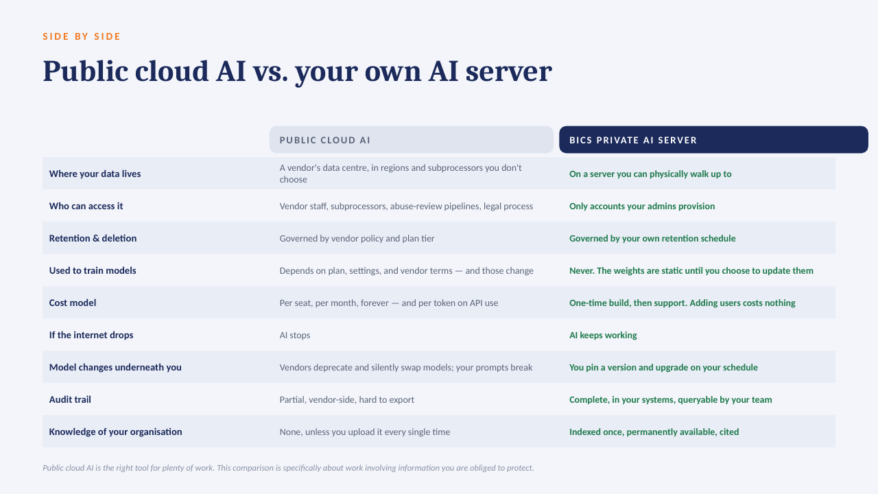
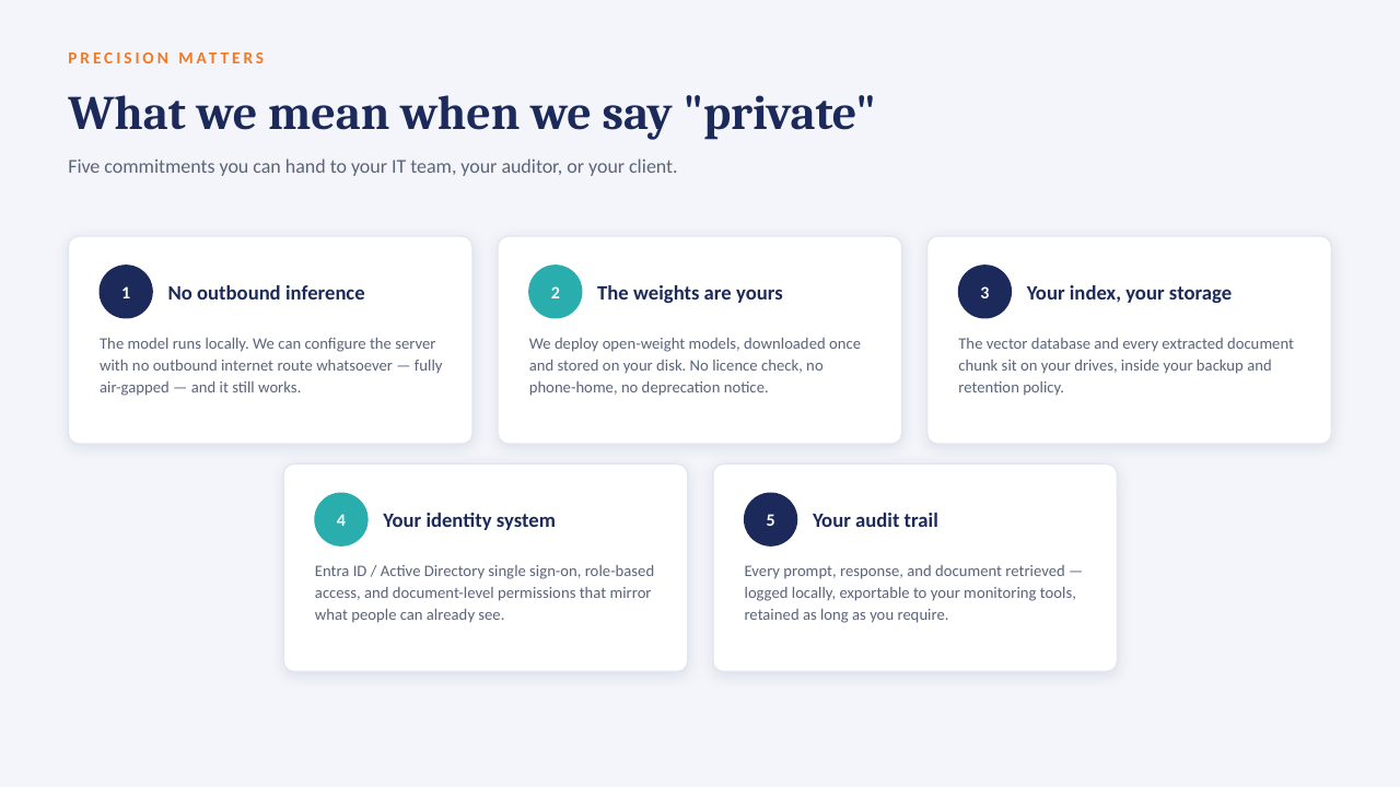
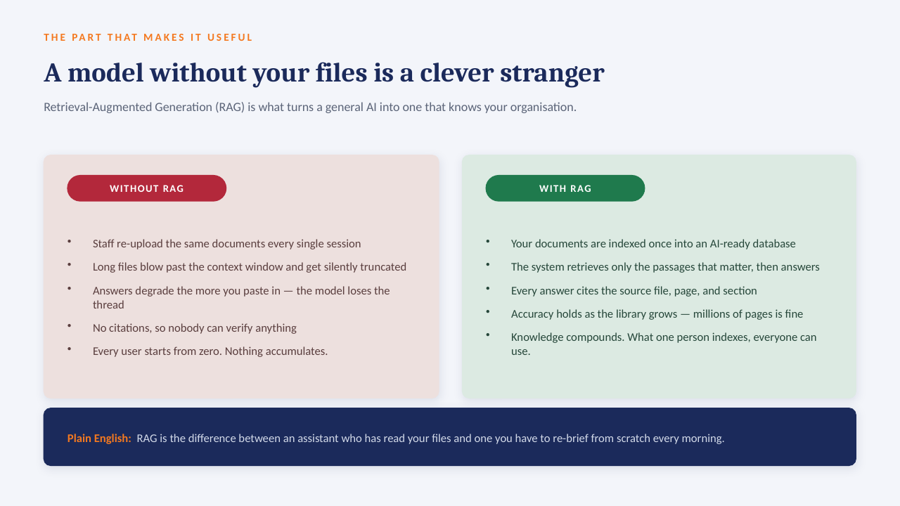
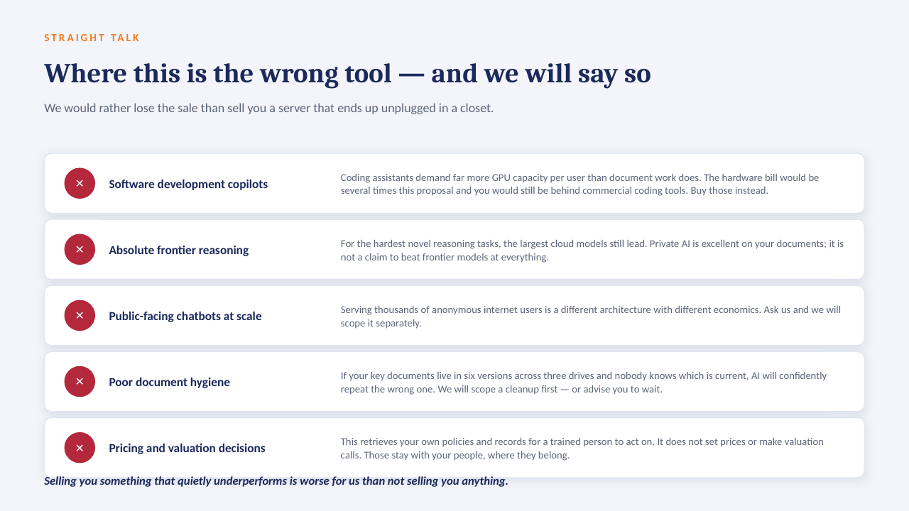
Private AI on your own server
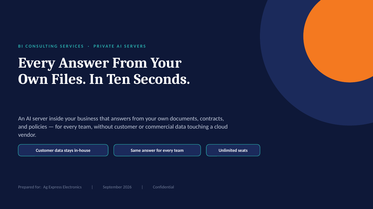
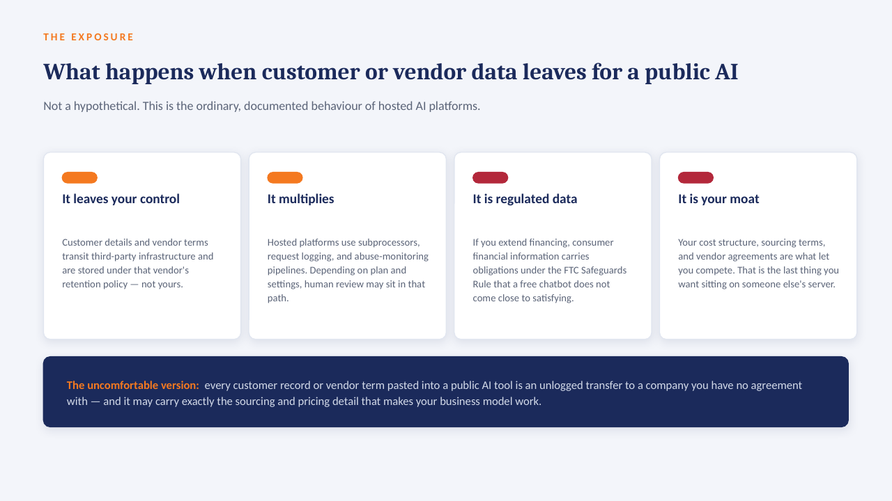
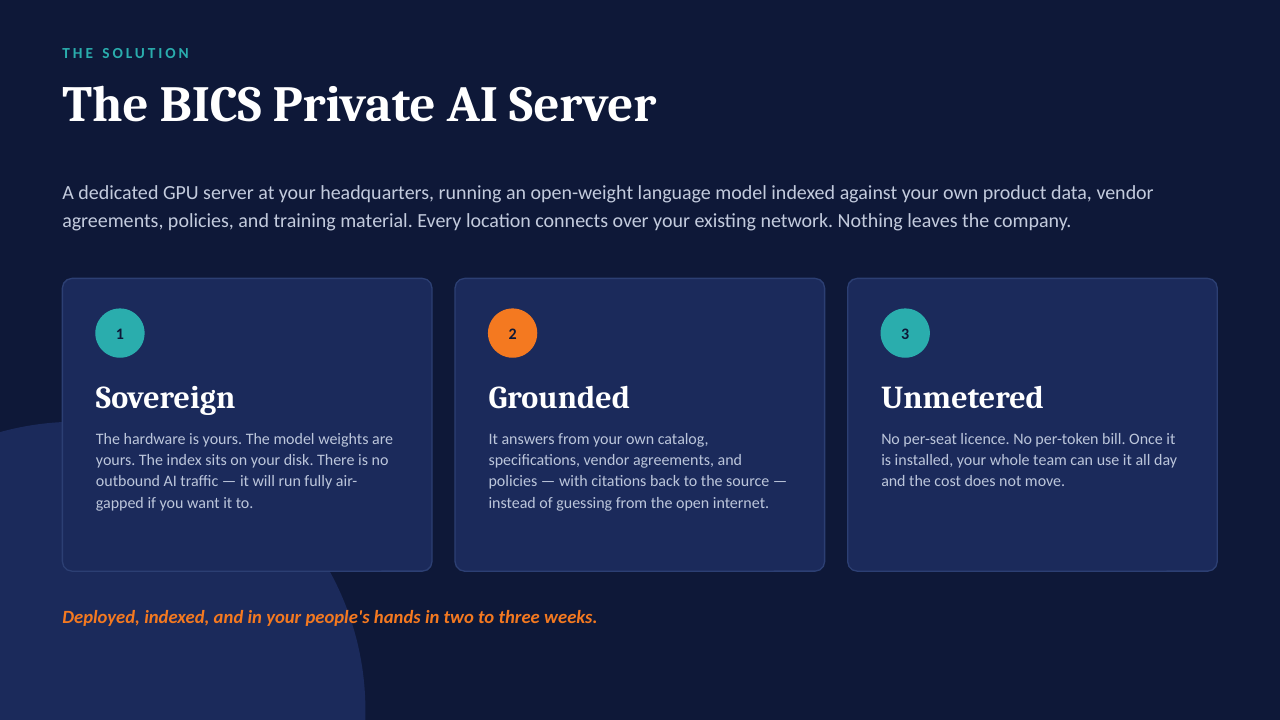
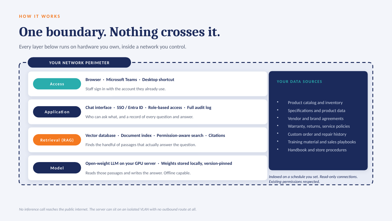
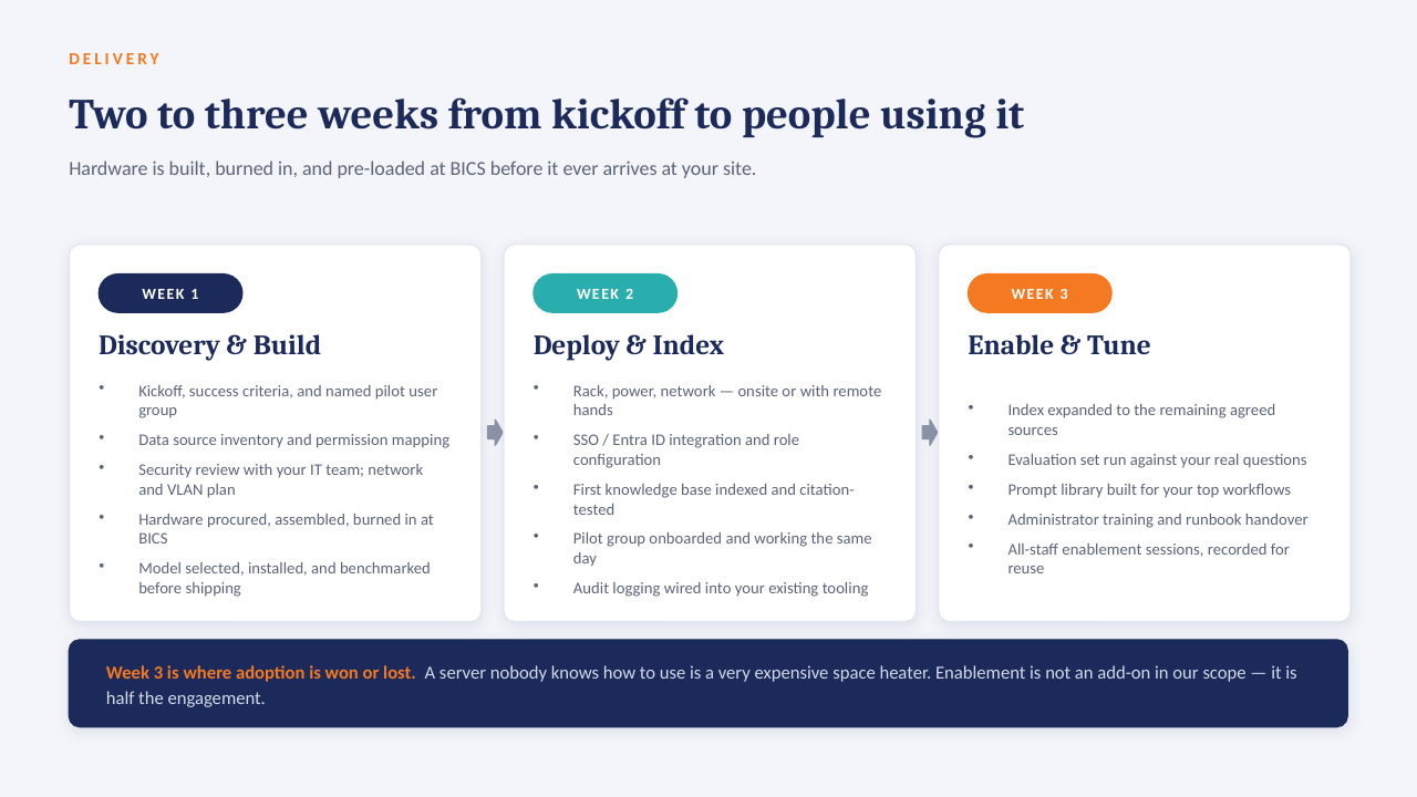
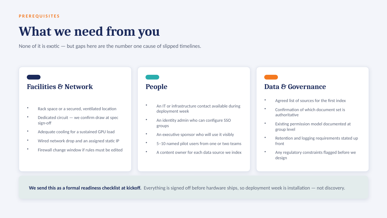
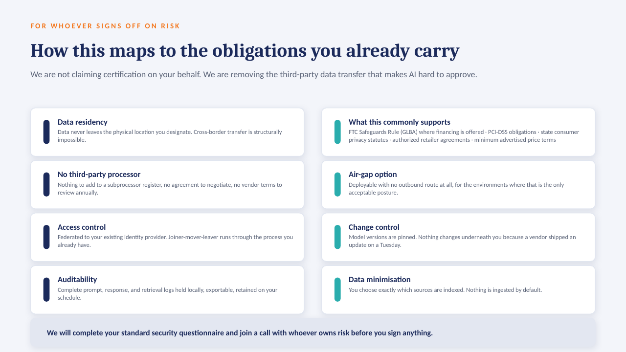
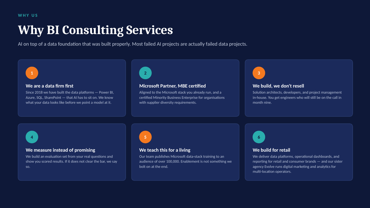
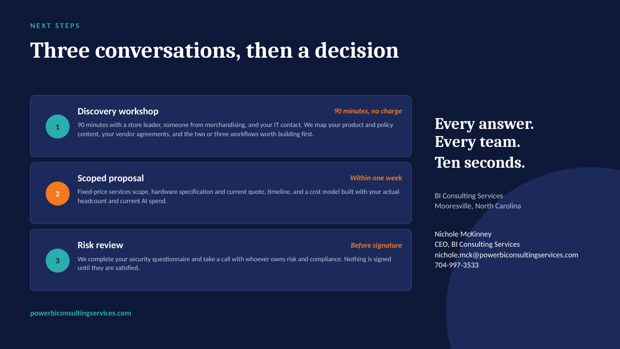
The "ask the data" ideas on this board are designed to run on a GPU server inside your own network — an open-weight model over your own documents, cited answers, no per-seat licence, nothing leaving the building. The short deck below explains how it works. Scroll through, or download it as a PDF.